By Matt Brousil
In this post I’ll walk through some of the basics for getting started importing, formatting, and creating maps with spatial data in R. Many students and researchers I know (myself included) have taken GIS coursework and are familiar with tools like ArcMap, but want to work with their data in R. R provides a good alternative to costly and potentially less reproducibility-friendly GIS tools, but it can be challenging to get started! This walkthrough is by no means exhaustive, but hopefully it will provide enough to give you a foothold and begin learning independently. I’ll assume you know a bit about GIS to begin with.
In order to follow along with this walkthrough you’ll want to install and load the following packages:
library(tidyverse)
library(sf)
library(cowplot)
library(ggspatial)
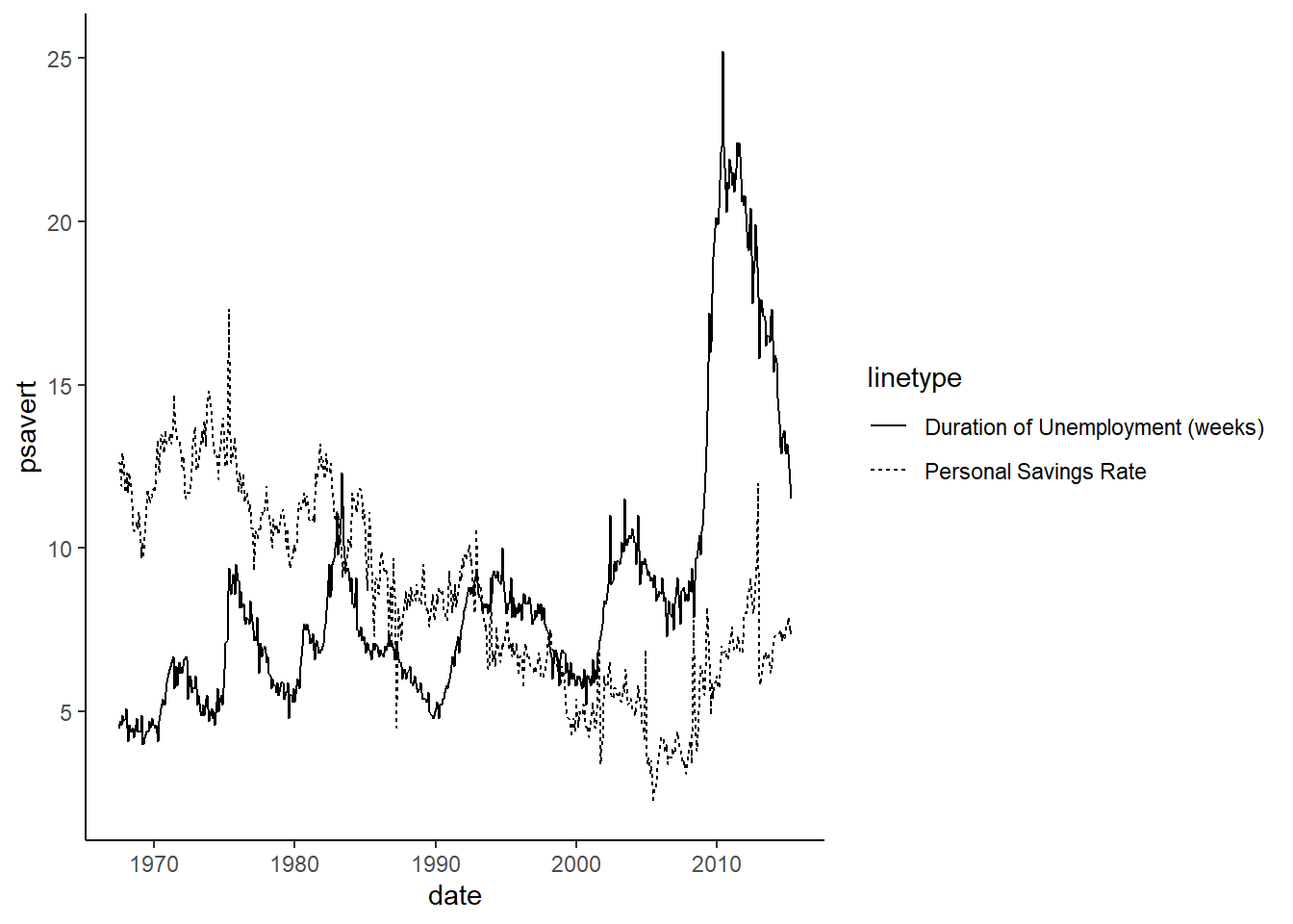
1. Quickly plot data for coordinate points
One of the more straightforward things you might want to do with mapping in R is to plot some points.
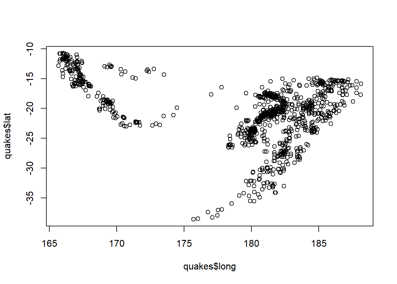
The built-in quakes dataset in R is an easy place for us to start. This dataset provides info on earthquakes near Fiji.
Take a look:
head(quakes)
##      lat   long depth mag stations
## 1 -20.42 181.62   562 4.8       41
## 2 -20.62 181.03   650 4.2       15
## 3 -26.00 184.10    42 5.4       43
## 4 -17.97 181.66   626 4.1       19
## 5 -20.42 181.96   649 4.0       11
## 6 -19.68 184.31   195 4.0       12
We have a column for the latitude of earthquake observations, one for the longitude, and then additional ones for the depth, magnitude and the number of stations reporting the quake.
Without even loading a package, you would be able to make a very basic map of these points using the plot function:
plot(quakes$long, quakes$lat)
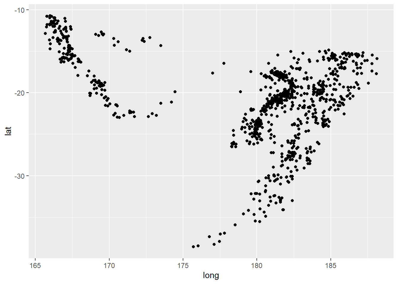
However, if you’re familiar with ggplot2 you can plot them a little more elegantly with a little bit more code:
ggplot(quakes) +
  geom_point(aes(x = long, y = lat))
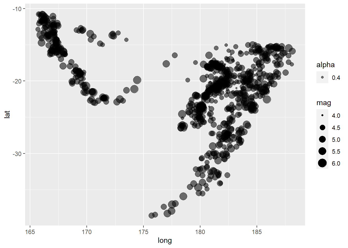
Perhaps you’d like to make the size of the points dependent on the magnitude of the earthquake:
ggplot(quakes) +
  geom_point(aes(x = long, y = lat, size = mag, alpha = 0.4))
![]()
Note that right now ggplot isn’t considering this spatial data yet, but just some points with coordinates.
From here you could take things further and format with different colors, plot themes, and plenty more. We’ll dive into some of this in the following sections. But let’s look at how to import our own data, plot it, and format the plot.
2. Build a map using external point and polygon files and add an inset
For the rest of this walkthrough I’ll be using a dataset by Pagano et al.(2019) containing polar bear satellite locations obtained from GPS collars. It’s available here. If you’re following along, you’ll want to download and unzip this folder.
We’ll be working mostly with the sf package now. There are several good vignettes on the package provided here and an explanation of the purpose of the package provided in this publication. Some of the basics are:
sf is built around “simple features”. Simple features are a standard for storing spatial datasf was authored by some of the same people as the earlier spatial package sp and allows us to work with spatial data using simple features much more effectively- One major benefit is that
sf has been written to coexist well with packages in the tidyverse
sf doesn’t work well with time series or raster data (see the stars and raster packages)sf stores spatial data in data frames (see tidyverse comment above)
2.1 Import, format, test
Let’s dive in. To start, we’ll load in the dataset. It contains GPS collar data from several adult female polar bears.
bears <- read_csv(file = "../data/polarBear_argosGPSLocations_alaska_pagano_2014.csv") %>%
  select(Bear:LocationQuality)
## Warning: Missing column names filled in: 'X7' [7], 'X8' [8], 'X9' [9]
##
## -- Column specification -----------------------------------------------------------------
## cols(
##   Bear = col_double(),
##   Type = col_character(),
##   Date = col_datetime(format = ""),
##   latitude = col_double(),
##   longitude = col_double(),
##   LocationQuality = col_character(),
##   X7 = col_logical(),
##   X8 = col_logical(),
##   X9 = col_datetime(format = "")
## )
You’ll notice I included the select statement above. When reading this file in I found that it contained extra empty columns. A good reminder that it’s important to look over your data when you import it into R.
What do the data look like?
head(bears)
## # A tibble: 6 x 6
##    Bear Type  Date                latitude longitude LocationQuality
##   <dbl> <chr> <dttm>                 <dbl>     <dbl> <chr>
## 1     1 GPS   2014-04-10 02:00:38     70.4     -146. G
## 2     1 Argos 2014-04-10 02:19:12     70.4     -146. L3
## 3     1 Argos 2014-04-10 02:50:59     70.4     -146. LB
## 4     1 Argos 2014-04-10 02:53:19     70.4     -146. L1
## 5     1 GPS   2014-04-10 03:00:38     70.4     -146. G
## 6     1 GPS   2014-04-10 04:00:38     70.4     -146. G
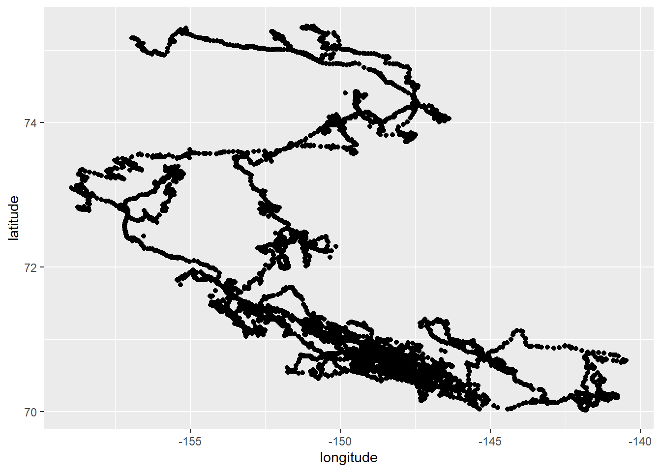
Just like the earthquake example earlier, we can plot these to get a sense for how they’re arranged spatially.
ggplot(bears) +
  geom_point(aes(x = longitude, y = latitude))
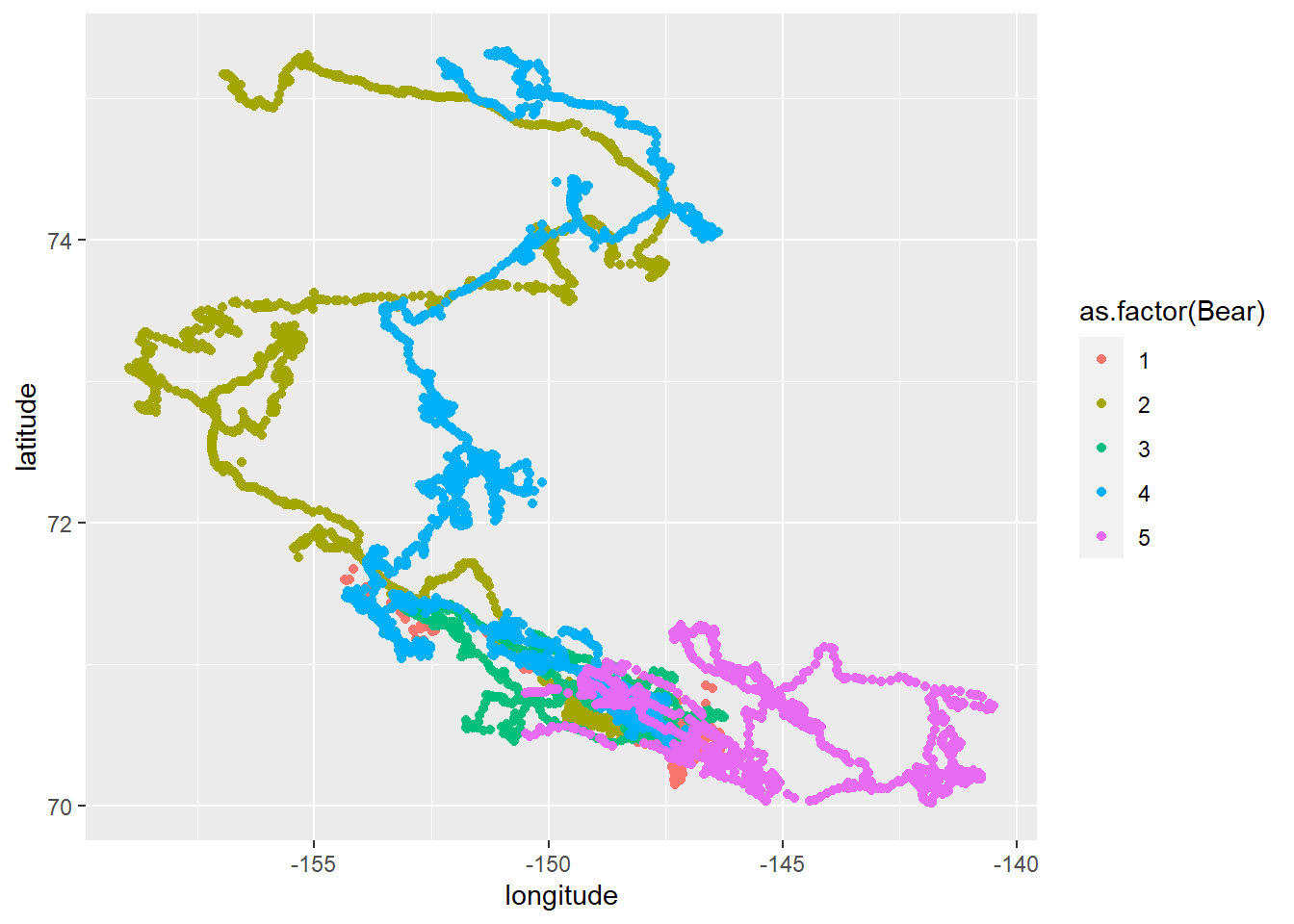
Knowing that there are multiple bears present in the dataset, we might want to color their points by their ID number. We’ll do so by converting the Bear column to a factor so that R doesn’t treat it like an ordinal or continuous variable when assigning colors.
ggplot(bears) +
  geom_point(aes(x = longitude, y = latitude, color = as.factor(Bear)))
Another option would be to create a separate map for each bear in the study, and to indicate the progression of time using color. We’ll facet by bear ID now, and color by date
ggplot(bears) +
  geom_point(aes(x = longitude, y = latitude, color = Date)) +
  facet_wrap(~ Bear)
![]()

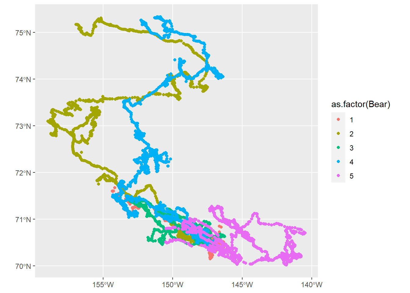
It’s very handy to be able to plot almost directly from a .csv file like this, but we could also convert this dataset into a more spatial-friendly sf object. Note that we provide a CRS, or coordinate reference system here. 4326 corresponds to WGS84.
bears_sf <- st_as_sf(x = bears,
                     coords = c("longitude", "latitude"),
                     # WGS84
                     crs = 4326)
NCEAS has a helpful info sheet about working with CRS in R here if you want to learn more.
What’s the result of us creating this new object?
bears_sf
## Simple feature collection with 9583 features and 4 fields
## geometry type:  POINT
## dimension:      XY
## bbox:           xmin: -158.9622 ymin: 70.0205 xmax: -140.4845 ymax: 75.33249
## geographic CRS: WGS 84
## # A tibble: 9,583 x 5
##     Bear Type  Date                LocationQuality             geometry
##  * <dbl> <chr> <dttm>              <chr>                    <POINT [°]>
##  1     1 GPS   2014-04-10 02:00:38 G               (-146.3468 70.39948)
##  2     1 Argos 2014-04-10 02:19:12 L3                   (-146.332 70.4)
##  3     1 Argos 2014-04-10 02:50:59 LB                 (-146.328 70.423)
##  4     1 Argos 2014-04-10 02:53:19 L1                 (-146.366 70.395)
##  5     1 GPS   2014-04-10 03:00:38 G               (-146.3469 70.39932)
##  6     1 GPS   2014-04-10 04:00:38 G               (-146.3455 70.39947)
##  7     1 Argos 2014-04-10 04:31:44 L3                 (-146.351 70.396)
##  8     1 Argos 2014-04-10 04:32:30 L2                 (-146.364 70.397)
##  9     1 GPS   2014-04-10 05:00:38 G               (-146.3459 70.39945)
## 10     1 GPS   2014-04-10 08:00:01 G               (-146.3419 70.40024)
## # ... with 9,573 more rows
We can see that the object is a tibble (data frame) but also has spatial data associated with it. The coordinate data is now stored in the geometry list column. If you want to pull the coordinates out of that object you can access them with st_coordinates().
Plotting sf objects with ggplot is remarkably simple using a geom_sf() layer:
ggplot(bears_sf) +
  geom_sf(aes(color = as.factor(Bear)))
2.2 More complex plotting
Let’s focus our efforts on plotting the GIS data for just one bear. We’ll filter for bear 2’s data just like we would if we were doing this operation on a normal data frame.
bear_two <- bears_sf %>%
  filter(Bear == 2)
I’d also like to include shapefiles in my map. In this instance, we could use these to add polygon layers for the state of Alaska and for sea ice at the time the bear was being tracked. We can use the st_read() function to bring in shapefiles.
# Multipolygon geometry
alaska <- st_read(dsn = "../data/cb_2018_us_state_5m/cb_2018_us_state_5m.shp") %>%
  filter(NAME == "Alaska")
## Reading layer `cb_2018_us_state_5m' from data source `C:\Users\matthew.brousil\Documents\R-talks\intro_to_mapping\data\cb_2018_us_state_5m\cb_2018_us_state_5m.shp' using driver `ESRI Shapefile'
## Simple feature collection with 56 features and 9 fields
## geometry type:  MULTIPOLYGON
## dimension:      XY
## bbox:           xmin: -179.1473 ymin: -14.55255 xmax: 179.7785 ymax: 71.35256
## geographic CRS: NAD83
# Sea ice from the first month that the bear was tracked
ice <- st_read(dsn = "../data/extent_N_201404_polygon_v3.0/extent_N_201404_polygon_v3.0.shp")
## Reading layer `extent_N_201404_polygon_v3.0' from data source `C:\Users\matthew.brousil\Documents\R-talks\intro_to_mapping\data\extent_N_201404_polygon_v3.0\extent_N_201404_polygon_v3.0.shp' using driver `ESRI Shapefile'
## Simple feature collection with 145 features and 1 field
## geometry type:  POLYGON
## dimension:      XY
## bbox:           xmin: -3225000 ymin: -4950000 xmax: 3425000 ymax: 5700000
## projected CRS:  NSIDC Sea Ice Polar Stereographic North
Now these files have been brought in largely ready-to-use. Let’s preview:
ggplot(ice) +
  geom_sf()

As a quick sidenote, the tigris package for R is an alternative resource for polygon data for US boundaries that you could use. It accesses shapefiles from the US Census and loads them as sf objects.
Now that we have three separate layers loaded in R it’s worth looking to see if they have matching coordinate reference systems. For example, if you wanted to do any direct comparisons of the layers to one another for spatial analysis you’d want to make sure they were compatible. st_crs() will return each layer’s CRS for us.
st_crs(bear_two)
## Coordinate Reference System:
##   User input: EPSG:4326
##   wkt:
## GEOGCRS["WGS 84",
##     DATUM["World Geodetic System 1984",
##         ELLIPSOID["WGS 84",6378137,298.257223563,
##             LENGTHUNIT["metre",1]]],
##     PRIMEM["Greenwich",0,
##         ANGLEUNIT["degree",0.0174532925199433]],
##     CS[ellipsoidal,2],
##         AXIS["geodetic latitude (Lat)",north,
##             ORDER[1],
##             ANGLEUNIT["degree",0.0174532925199433]],
##         AXIS["geodetic longitude (Lon)",east,
##             ORDER[2],
##             ANGLEUNIT["degree",0.0174532925199433]],
##     USAGE[
##         SCOPE["unknown"],
##         AREA["World"],
##         BBOX[-90,-180,90,180]],
##     ID["EPSG",4326]]
st_crs(ice)
## Coordinate Reference System:
##   User input: NSIDC Sea Ice Polar Stereographic North
##   wkt:
## PROJCRS["NSIDC Sea Ice Polar Stereographic North",
##     BASEGEOGCRS["Unspecified datum based upon the Hughes 1980 ellipsoid",
##         DATUM["Not specified (based on Hughes 1980 ellipsoid)",
##             ELLIPSOID["Hughes 1980",6378273,298.279411123064,
##                 LENGTHUNIT["metre",1]]],
##         PRIMEM["Greenwich",0,
##             ANGLEUNIT["degree",0.0174532925199433]],
##         ID["EPSG",4054]],
##     CONVERSION["US NSIDC Sea Ice polar stereographic north",
##         METHOD["Polar Stereographic (variant B)",
##             ID["EPSG",9829]],
##         PARAMETER["Latitude of standard parallel",70,
##             ANGLEUNIT["degree",0.0174532925199433],
##             ID["EPSG",8832]],
##         PARAMETER["Longitude of origin",-45,
##             ANGLEUNIT["degree",0.0174532925199433],
##             ID["EPSG",8833]],
##         PARAMETER["False easting",0,
##             LENGTHUNIT["metre",1],
##             ID["EPSG",8806]],
##         PARAMETER["False northing",0,
##             LENGTHUNIT["metre",1],
##             ID["EPSG",8807]]],
##     CS[Cartesian,2],
##         AXIS["easting (X)",south,
##             MERIDIAN[45,
##                 ANGLEUNIT["degree",0.0174532925199433]],
##             ORDER[1],
##             LENGTHUNIT["metre",1]],
##         AXIS["northing (Y)",south,
##             MERIDIAN[135,
##                 ANGLEUNIT["degree",0.0174532925199433]],
##             ORDER[2],
##             LENGTHUNIT["metre",1]],
##     USAGE[
##         SCOPE["unknown"],
##         AREA["World - N hemisphere - north of 60°N"],
##         BBOX[60,-180,90,180]],
##     ID["EPSG",3411]]
st_crs(alaska)
## Coordinate Reference System:
##   User input: NAD83
##   wkt:
## GEOGCRS["NAD83",
##     DATUM["North American Datum 1983",
##         ELLIPSOID["GRS 1980",6378137,298.257222101,
##             LENGTHUNIT["metre",1]]],
##     PRIMEM["Greenwich",0,
##         ANGLEUNIT["degree",0.0174532925199433]],
##     CS[ellipsoidal,2],
##         AXIS["latitude",north,
##             ORDER[1],
##             ANGLEUNIT["degree",0.0174532925199433]],
##         AXIS["longitude",east,
##             ORDER[2],
##             ANGLEUNIT["degree",0.0174532925199433]],
##     ID["EPSG",4269]]
Alas, the CRS of the three layers don’t match.
Because the three layers all do have a CRS already, we’ll want to do transformations to put them in the same system. For this we’ll use st_transform(). If instead you wanted to assign a CRS to an object that did not have one you would use st_crs().
bear_two_pcs <- st_transform(x = bear_two, crs = 3467)

alaska_pcs <- st_transform(x = alaska, crs = 3467)

ice_pcs <- st_transform(x = ice, crs = 3467)
Note that these layers would have plotted successfully even if we didn’t transform their CRS. But the plotting would not have been pretty.
With transformation:
ggplot() +
  geom_sf(data = alaska_pcs) +
  geom_sf(data = ice_pcs) +
  geom_sf(data = bear_two_pcs)
Without transformation:
ggplot() +
  geom_sf(data = alaska) +
  geom_sf(data = ice) +
  geom_sf(data = bear_two)
Next we’ll want to zoom in a bit. It would help to know the rough spatial boundaries of the polar bear data in order to do this well. We can use st_bbox() to get this
information in the form of a bounding box, save it, then use it to define the boundaries of our plot. I’ve also added colors to differentiate the sea ice from Alaska’s land area.
limits <- st_bbox(bear_two_pcs)

bear_plot <- ggplot() +
  geom_sf(data = alaska_pcs, fill = "seashell", color = "snow3") +
  geom_sf(data = ice_pcs, fill = "lightcyan", color = "snow3") +
  geom_sf(data = bear_two_pcs, alpha = 0.3) +
  coord_sf(xlim = c(limits["xmin"], limits["xmax"]),
           ylim = c(limits["ymin"], limits["ymax"])) +
  theme_bw()
Now we have a plot that is starting to look usable:
bear_plot
You might want to add things like a north arrow or a scale bar. The ggspatial package provides some options for doing this with the functions annotation_scale() and annotation_north_arrow().
bear_plot <- bear_plot +
  # Place a scale bar in top left
  annotation_scale(location = "tr") +
  annotation_north_arrow(location = "tl",
                         # Use true north
                         which_north = "true",
                         height = unit(0.75, "cm"),
                         width = unit(0.75, "cm"))

bear_plot
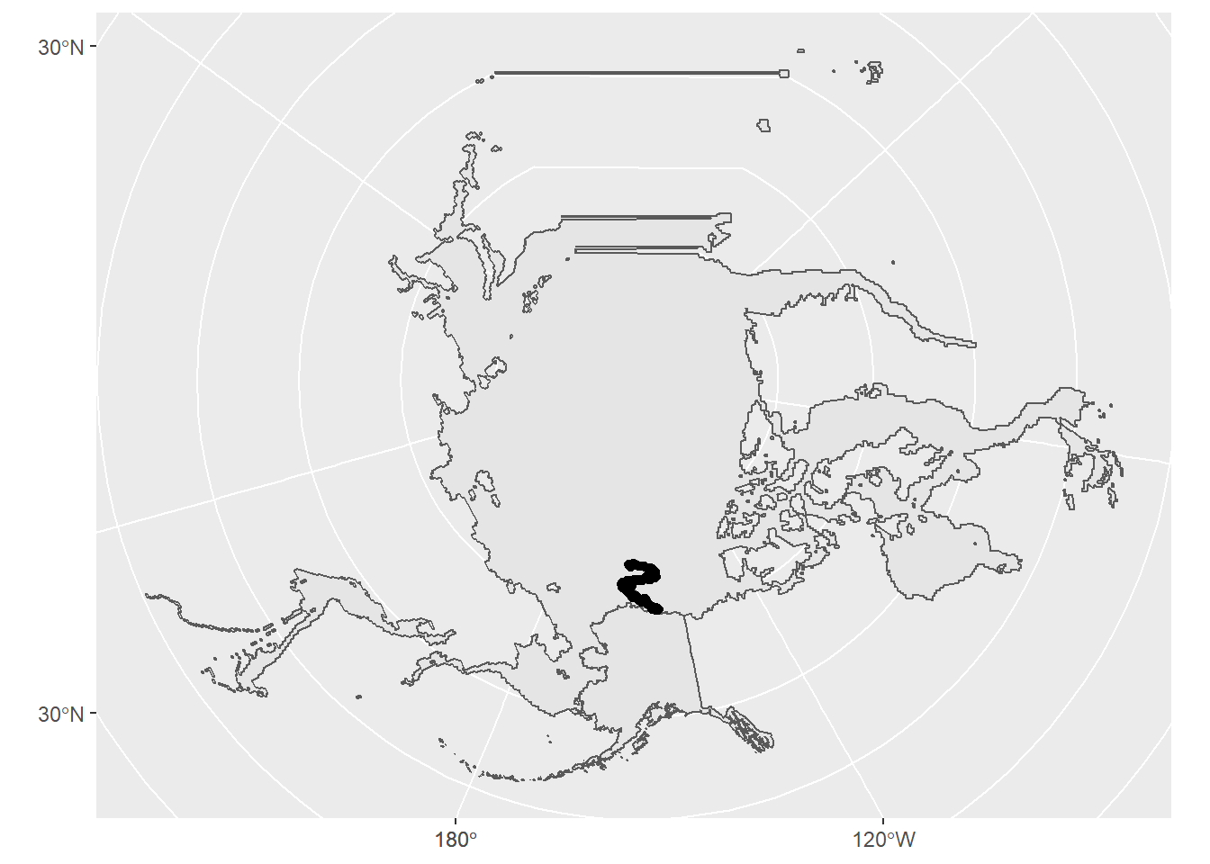
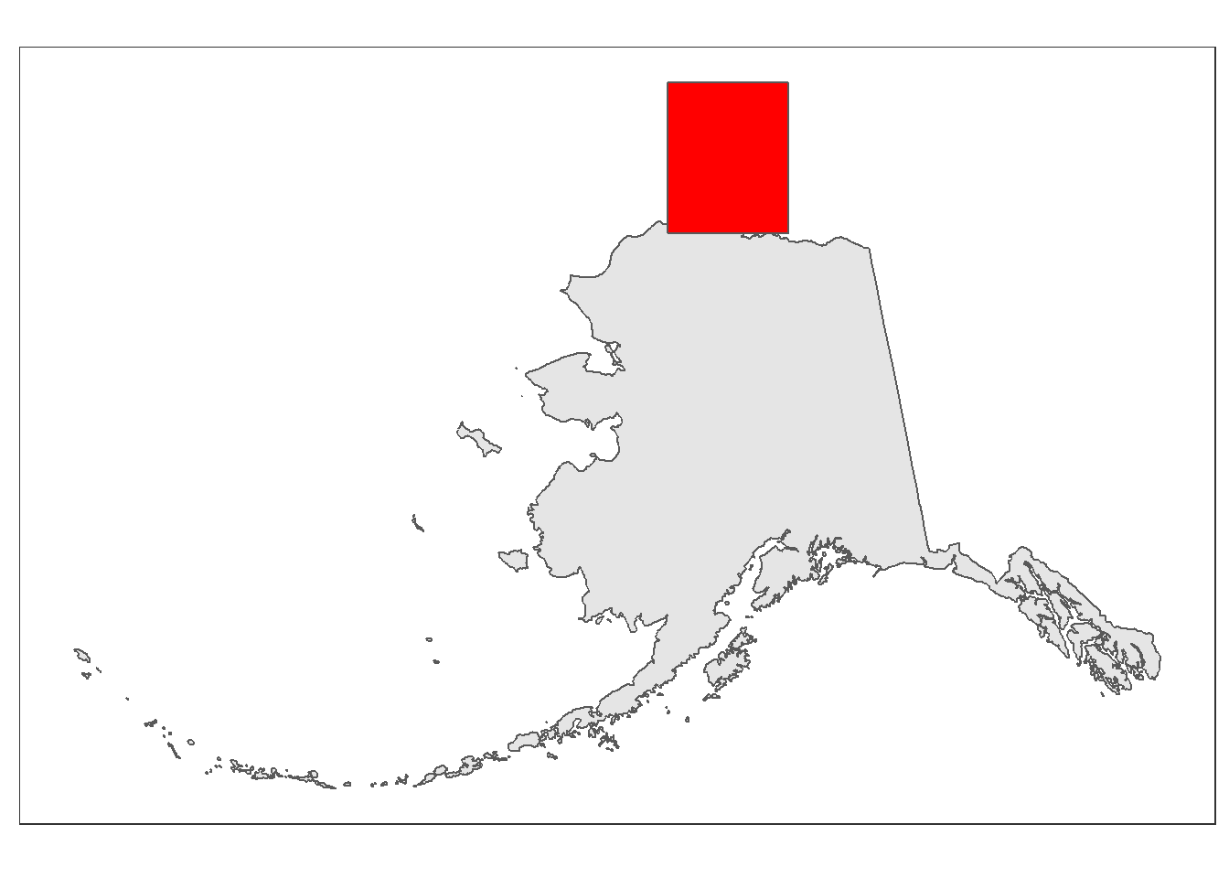
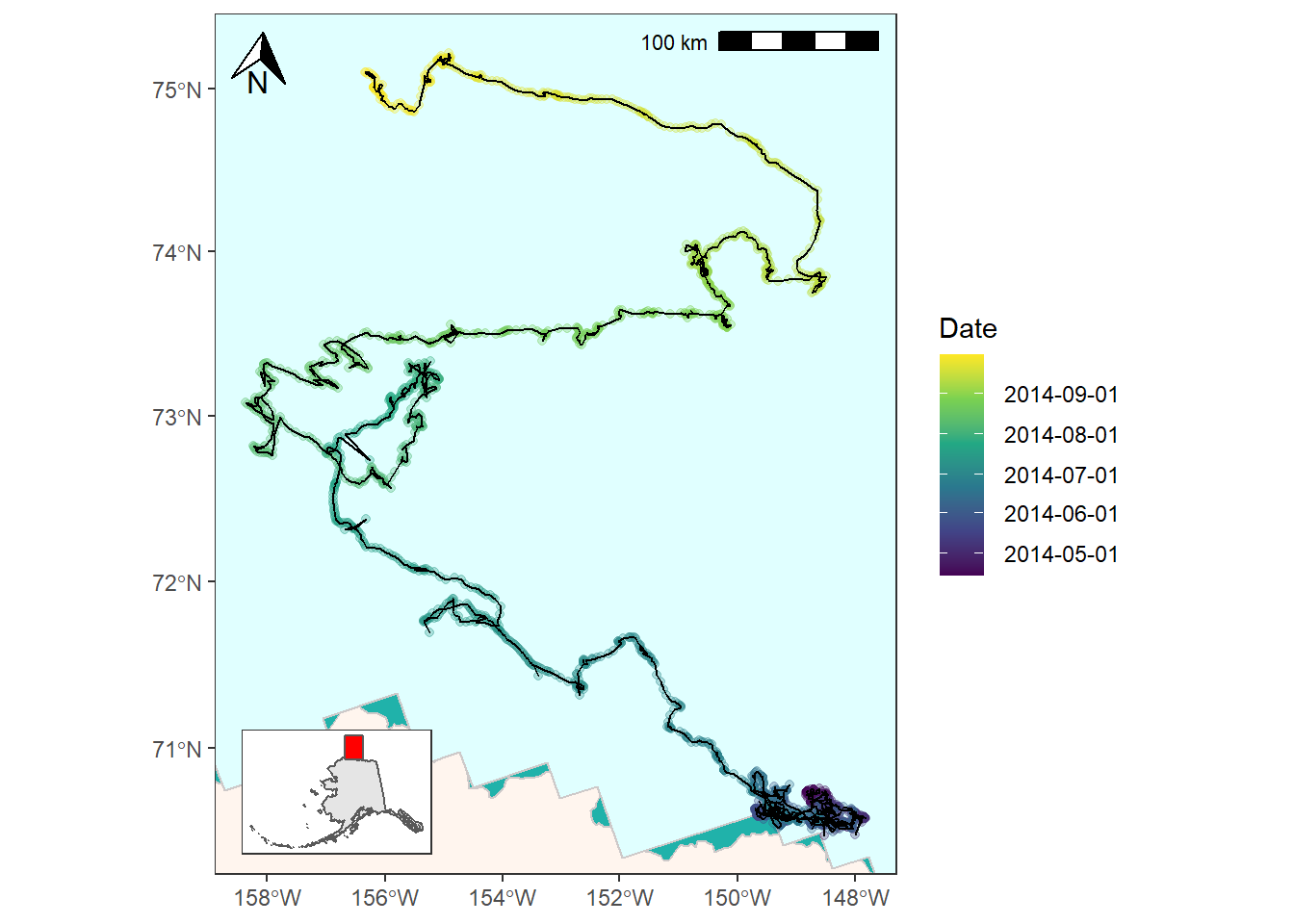
For the next step we’ll add an inset map to show the geographic context of where this study took place. This map will be zoomed out and show just the state of Alaska for reference. In order to do this we’ll need to create a second ggplot object and then use cowplot::ggdraw() to combine our two maps.
First, create the inset map. We want something pretty basic. The limits object we made from st_bbox()earlier can be plotted if we run it through st_as_sfc() to create a polygon from it.
inset_map <- ggplot(data = alaska_pcs) +
  geom_sf() +
  geom_sf(data = st_as_sfc(limits), fill = "red") +
  theme_bw() +
  xlab("") +
  ylab("") +
  theme(axis.title.x = element_blank(),
        axis.title.y = element_blank(),
        panel.grid = element_blank(),
        axis.text = element_blank(),
        axis.ticks = element_blank(),
        plot.background = element_blank())

inset_map
Now that we’ve successfully made a map that we want to place as an inset it’s time to combine our two ggplot objects into one using ggdraw(). You’ll want to play around with the arguments to your inset ggdraw() call until you’ve arranged it in a way you like.
ggdraw() +
  draw_plot(bear_plot) +
  draw_plot(plot = inset_map,
            x = 0.13, # x location of inset placement
            y = 0.009, # y location of inset placement
            width = .455, # Inset width
            height = .26, # Inset height
            scale = .66) # Inset scale
2.3 Taking this further
There are a couple other places you might want to make changes to the map we’ve created. For one, you might want to use color to code the bear’s path by date to show how long it lingered in some locations.
We first will need to create breakpoints that we can feed to ggplot for this. We’ll use pretty() from base R to generate equally spaced dates and corresponding labels for the legend.
date_breaks <- tibble(dates_num = as.numeric(pretty(bear_two_pcs$Date)),
                      dates_lab = pretty(bear_two_pcs$Date))

date_breaks
## # A tibble: 7 x 2
##    dates_num dates_lab
##        <dbl> <dttm>
## 1 1396310400 2014-04-01 00:00:00
## 2 1398902400 2014-05-01 00:00:00
## 3 1401580800 2014-06-01 00:00:00
## 4 1404172800 2014-07-01 00:00:00
## 5 1406851200 2014-08-01 00:00:00
## 6 1409529600 2014-09-01 00:00:00
## 7 1412121600 2014-10-01 00:00:00
You can use scale_color_viridis_c() (or another scale_color_ option if you want) and provide it dates_num as the color breaks and dates_lab as the break labels. Note that I also add in a fill color for panel.background to give the the appearance of water.
bear_time_plot <- ggplot() +
geom_sf(data = alaska_pcs, fill = "seashell", color = "snow3") +
geom_sf(data = ice_pcs, fill = "lightcyan", color = "snow3") +
geom_sf(data = bear_two_pcs, aes(color = as.numeric(Date)), alpha = 0.3) +
coord_sf(xlim = c(limits["xmin"], limits["xmax"]),
ylim = c(limits["ymin"], limits["ymax"])) +
scale_color_viridis_c(name = "Date",
breaks = date_breaks$dates_num,
labels = date_breaks$dates_lab) +
theme_bw() +
theme(panel.background = element_rect(fill = "lightseagreen"),
panel.grid = element_blank()) +
# Place a scale bar in top left
annotation_scale(location = "tr") +
annotation_north_arrow(location = "tl",
# Use true north
which_north = "true",
height = unit(0.75, "cm"),
width = unit(0.75, "cm"))
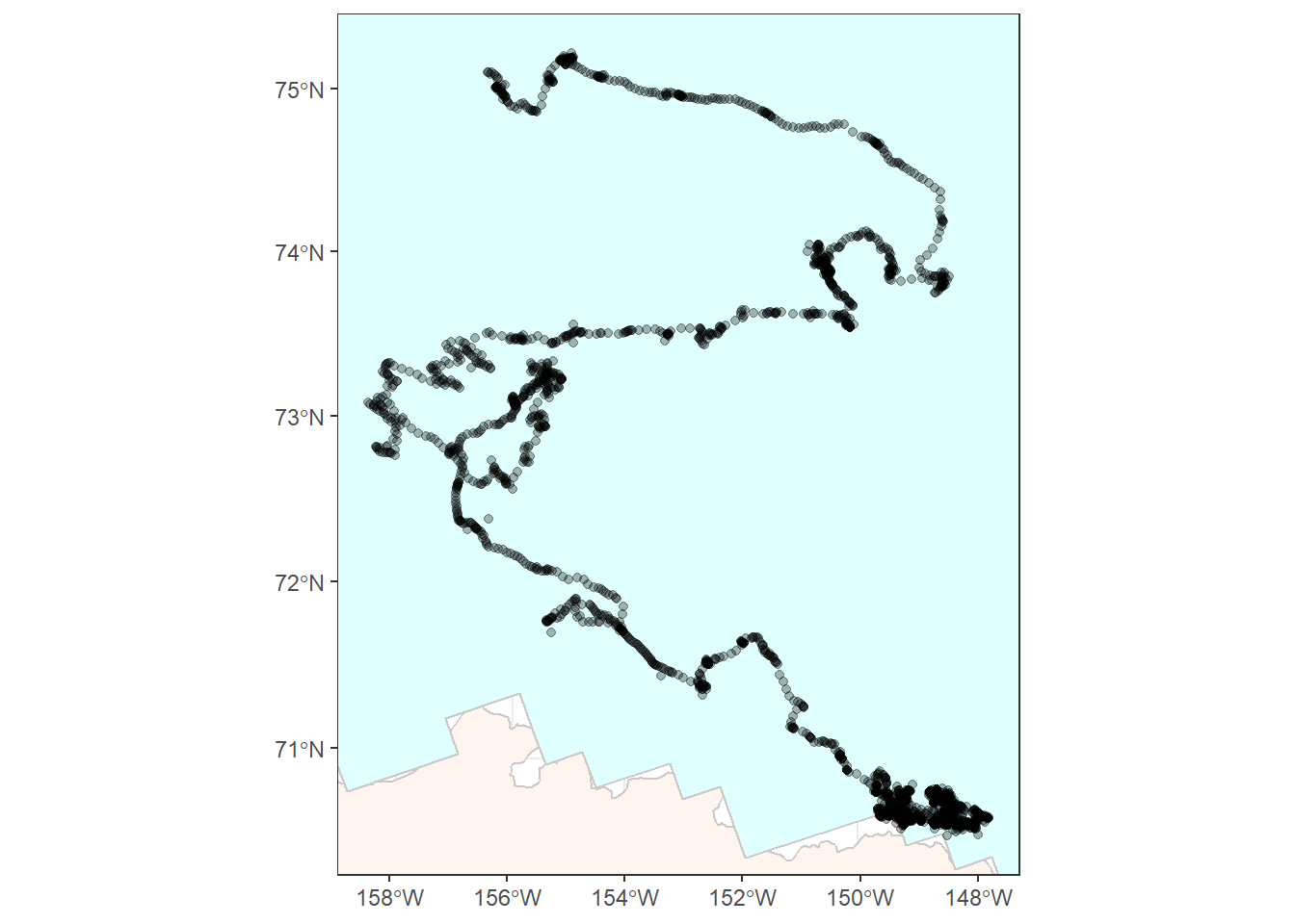
bear_time_plot
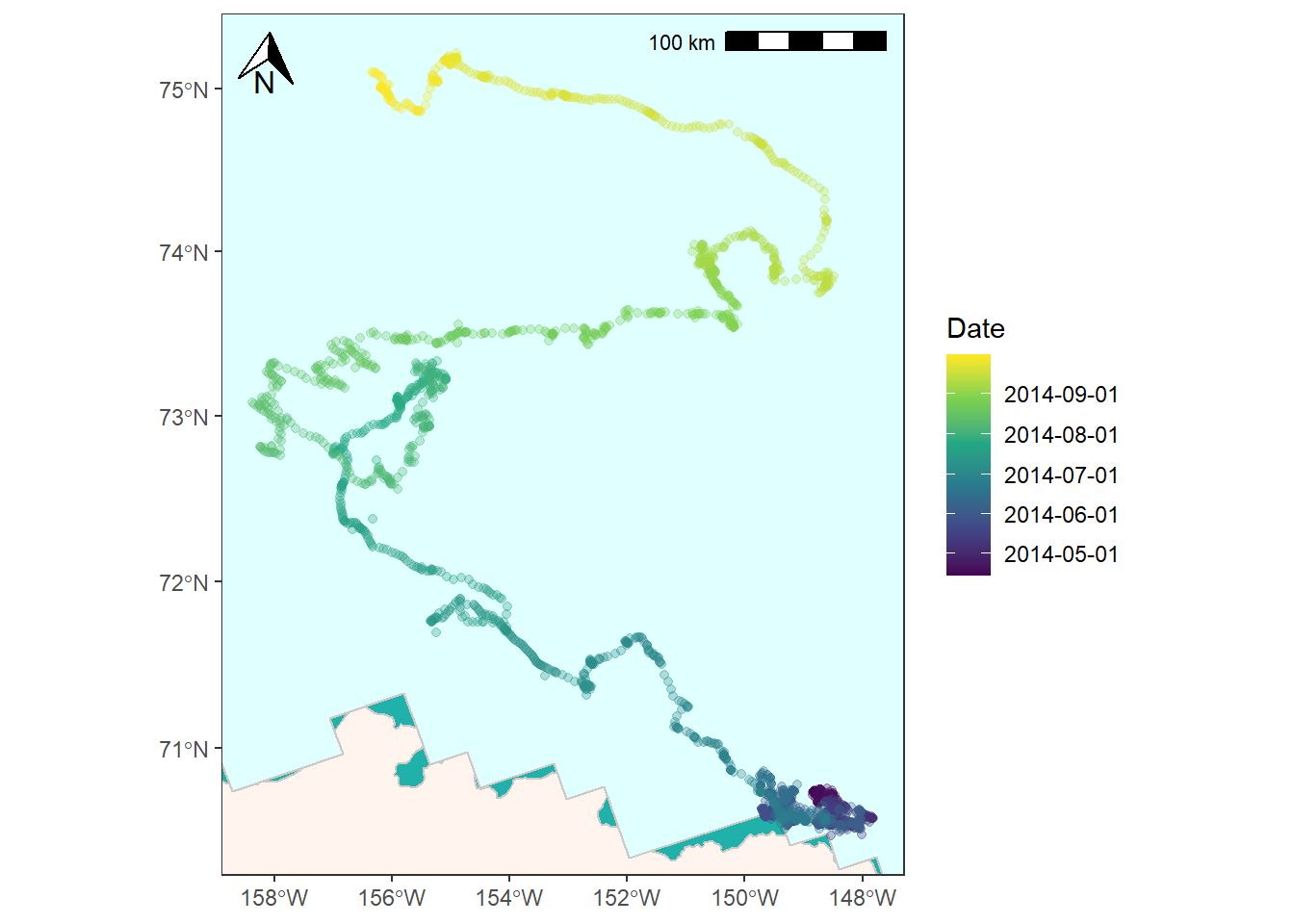
![]()
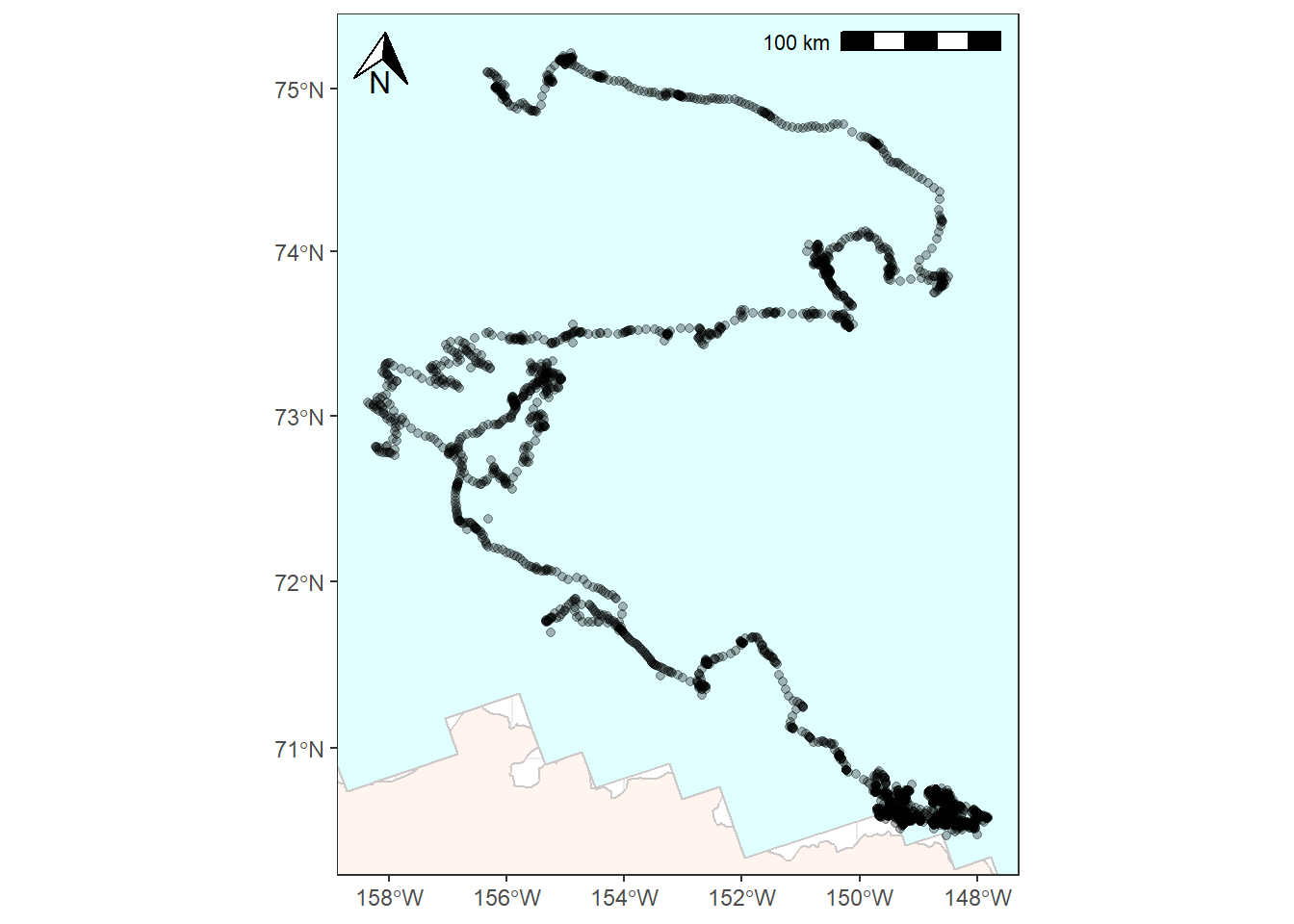
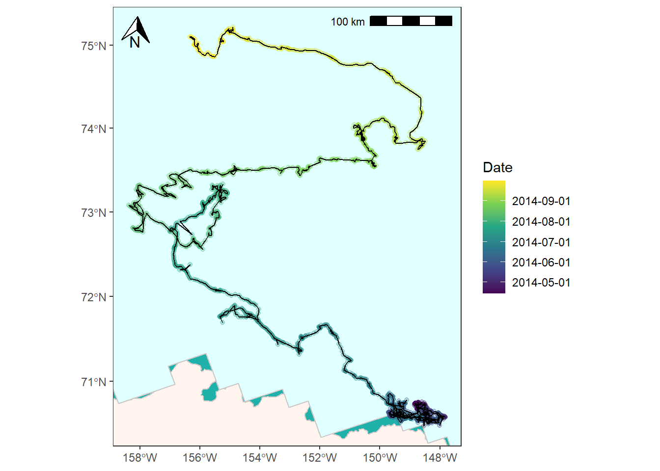
And lastly, you might want to represent the GPS data as a line instead of a series of points. (Read here for a discussion on converting to LINESTRINGS). You’ll need to convert the points first and then you can plot as normal.
# Convert points to LINESTRING
bear_two_line <- bear_two_pcs %>%
  summarise(do_union = FALSE) %>%
  st_cast("LINESTRING")

bear_time_plot +
  geom_sf(data = bear_two_line, color = "black") +
  coord_sf(xlim = c(limits["xmin"], limits["xmax"]),
           ylim = c(limits["ymin"], limits["ymax"]))
## Coordinate system already present. Adding new coordinate system, which will replace the existing one.
![]()
ggdraw() +
  draw_plot(bear_time_plot +
              geom_sf(data = bear_two_line, color = "black") +
              coord_sf(xlim = c(limits["xmin"], limits["xmax"]),
                       ylim = c(limits["ymin"], limits["ymax"]))) +
  draw_plot(plot = inset_map,
            x = 0.03, # x location of inset placement
            y = 0.009, # y location of inset placement
            width = .455, # Inset width
            height = .26, # Inset height
            scale = .66) # Inset scale
## Coordinate system already present. Adding new coordinate system, which will replace the existing one.
![]()
References
- Fetterer, F., K. Knowles, W. N. Meier, M. Savoie, and A. K. Windnagel. 2017, updated daily. Sea Ice Index, Version 3. [Monthly ice extent ESRI shapefile, April 2014]. Boulder, Colorado USA. NSIDC: National Snow and Ice Data Center. doi: https://doi.org/10.7265/N5K072F8. [Accessed 2021-02-07].
- Pagano, A. M., Atwood, T. C. and Durner, G. M., 2019, Satellite location and tri-axial accelerometer data from adult female polar bears (Ursus maritimus) in the southern Beaufort Sea, April-October 2014: U.S. Geological Survey data release, https://doi.org/10.5066/P9VA5I0M.
- Pebesma E (2018). “Simple Features for R: Standardized Support for Spatial Vector Data.” The R Journal, 10(1), 439–446. doi: 10.32614/RJ-2018-009, https://doi.org/10.32614/RJ-2018-009.
- https://github.com/r-spatial/sf/issues/321
- 2018 TIGER/Line Shapefiles (machinereadable data files) / prepared by the U.S. Census Bureau, 2018